How To Analyze Crypto Market Charts on TradingView
The website is used by over 30 million users globally. Its main features include professional charting tools for financial markets and a graphical interface that makes it possible to track and predict market trends. Lastly, it’s used for the analysis of profitable investment opportunities.
The cryptocurrency market has found its own user base on TradingView. With a little bit of training, you can learn how to analyze crypto charts to make better financial decisions concerning your investments. The cryptocurrency markets aren’t that different from traditional financial markets, but they have their own characteristics and peculiarities.
Let’s now see how to analyze a TradingView chart and understand what it shows.
Understanding What Candlesticks and Candlestick Charts Are
Candlesticks show the price of a particular asset in a specific period. So by looking at a candle, we can see a few different things.
Take a look at this Bitcoin/USDT chart from TradingView to understand what information a single candlestick entails.

A candle is made up of a body and a wick. The body is the wide part of the image, and the narrow lines you see above and under it are called wicks. The size of the body depends on the price movement in that time period. For example, suppose these candles are for the 1-hour chart. In that case, the body shows how much the price fluctuated during that hour.
Candlesticks can be green or red. A green candle on a 1-hour chart shows that the price closed above the value it opened at after one hour. Opposite to that, a red candle shows that the closing value has depreciated compared to the valuation at the start of that period.
But how do we know where the price opened and where it closed?
Look at the body of the green candle above. The bottom line of its body was the asset's price when that time period started. The top of the body represents the value when the timeframe ended. The wicks show the highest and lowest value the price moved to during that period. The wick on top is obviously the high, while the one at the bottom is the low.
A red candle is an exact opposite. The top of this candle’s body is the opening price, while the bottom is the closing one. The wick lines are the same as with the bullish green candlestick.
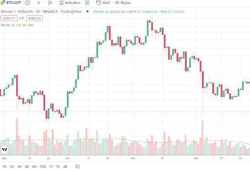
When we group these candles together, we get a candlestick chart that looks something like this:
Recognizing Trends and Market Movements Based on Candlesticks
Now that we know what candlesticks are, we can look at TradingView charts and try to predict trending markets. Knowing whether we are in an upward or downward trend makes it easier to predict what happens next and when and where to place our buy and sell orders. Making trading decisions based on a current trend is a popular strategy because it’s easier than predicting when a bear or bull market is likely to start.
Uptrend Markets
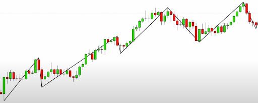
When the market is in an uptrend, you will notice that the candles create the following movements: new highs, followed by higher lows, new higher highs, new higher lows, etc., in regular intervals.
Here is an excellent example of how that looks on a candlestick chart:
But not all graphs are that simple, and sometimes it is difficult to recognize the patterns of a trending market. Therefore, there are some other indicators you should pay attention to.
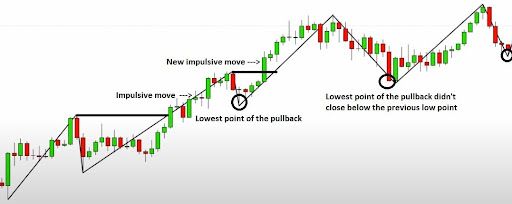
One interesting thing we can watch out for in trending markets are so-called impulsive moves. Whenever a price change leads to reaching a new high, we call that an impulsive move. After such an event, we often see a pullback. A pullback in an uptrend is when the value drops down from its peak for a brief period.
To check whether the market is still trending upwards, we need to look at the charts and check the lowest closing price of the previous pullback. The value can’t close below that price for the market to still be considered an uptrend. When we see an impulsive move followed by a new high, the subsequent price action will be a pullback. The latest lowest point of that pullback must be above the line of the previous one. If it isn’t and closes below it, we may be witnessing a reversal and an end of the uptrend movement.
This is how it looks on our previous graph:
Downtrend Markets
Using the opposite rules that we applied to upward movements, a downward market is recognized by lower lows and lower highs than what we witnessed previously.
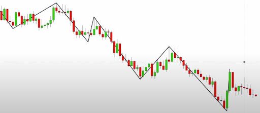
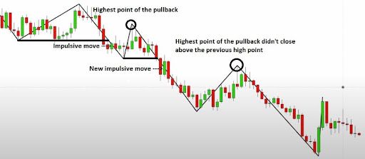
We will use the same logic with impulsive moves and pullbacks to determine whether we are still in a downward trending market. However, a pullback will cause a slight rise in the asset’s value in this scenario.
When we have an impulsive move followed by a pullback, the market can’t close above the highest point of the previous pullback. As long as it stays below, we are still in a downtrend market.
Here we can see that represented on the graph:
Support & Resistance: What Is It and How to Take Advantage of It?
Support and resistance are zones where a traded asset finds a type of barrier that prevents it from further growth or decline. For example, if Bitcoin’s value drops, support will act as a safe zone to stop further price depreciation. Why? Because traders have submitted enough buy orders at that level to purchase the asset at a discount. Opposite of that, we have resistance. This tool acts as another barrier that stops the further rise of a listed asset.
Support and resistance can be used to identify 3 things:
- Possible reversals
- Entry points into a trending market
- Stop-loss and target zones in trending markets
Identify Entry Points Based on Support and Resistance
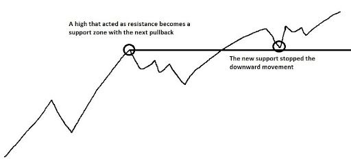
If we suppose that an upward trending market will continue, we can find a previous high point (which acted as resistance) that was later broken during an impulsive move. That high now becomes support after a market pullback. If the price drops to that area and rebounds back up, the zone can be considered support.
Let’s look at a simple chart showing this concept on an upward market.
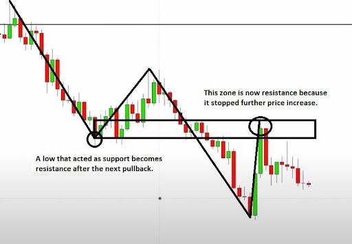
We apply the opposite approach in a downtrend market if we expect the bearish trend to continue. We are looking for a low point that acted as support just before a pullback to find these zones. After the price rebounded back up from the support zone, the downtrend continued, the previous low point was broken, and a new low was set. We then witness a second pullback after an impulsive move. The price shoots back up to the zone that acted as a support. However, this area has now become resistance causing the market to reverse and continue the downtrend.
This is how it looks like on a TradingView graph:
Identifying these areas of interest makes it easier to set buy or sell orders in a trending market. That's because we now have a good idea of how the price action will continue.
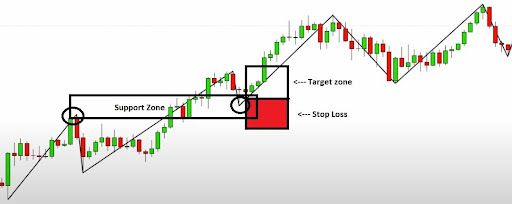
Suppose you have successfully recognized support and resistance in an upward market. In that case, you know the area beyond which the price will not fall. You can set your buy order in this support zone with a stop-loss slightly under it just in case the price drops further before it rebounds. By now, you have learned that in a bullish (uptrend) market, the lowest point of the pullback can’t close below the low point of the previous pullback. If that is still the case, the current trend will likely continue, and a new high will be broken. If you are a trader, your target zone where you take profits could be in the area of the previous high.
Summary
TradingView is the most popular charting tool in the world. Candlesticks are the main components of any professional graph. Based on the candle movements and patterns, it’s possible to determine what direction a market is taking. The two most common scenarios are upward and downward trends.
By identifying zones in a trending market that act as support and resistance, we will understand what to expect next and apply our trading strategy. If the goal is to trade profitably, we can use this knowledge to set a realistic target zone where we intend to sell and a stop-loss limit to protect us from significant upsets.

